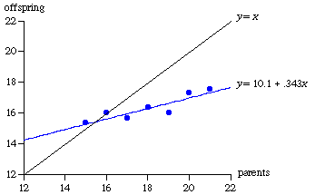
In another study, Galton purchased family records that contained the heights of 205 pairs of parents and their 928 adult children.[2] Because the average male is about 8 percent taller than the average female, he multiplied the female heights by 1.08 to make them comparable to the male heights. The heights of each mother and father were then averaged to give a “mid-parent height.” The mid-parent heights were divided into nine categories and the median height of the children of parents in each category was computed. Figure 2 shows that again he found regression toward the mean. The .69 slope of the least squares line indicates that parents whose heights are 1 inch above (or below) average tend to have children whose heights are .69 inch above (or below) average.
To explain this important statistical phenomenon, we can label someone who, at conception, has a genetically predicted adult height of 74 inches a person with “74-inch genes.” Heights are, of course, affected by diet, exercise, and other environmental factors, and a person with 74-inch genes might grow up to be 72-inches or 76-inches tall. Because a person’s adult height is not a perfect reflection of one’s genes, it is not a perfect predictor of the genetically expected height of one’s children. A person who is 76-inches tall might have 74-inch genes and experienced positive environmental influences or might have 78-inch genes and had negative environmental factors. The former is more likely, simply because there are many more people with 74-inch genes than with 78-inch genes. Thus the observed heights of very tall parents are usually an overstatement of the genetic heights that they will pass on to their children.
This reasoning does not imply that we will soon all be the same height. Indeed, we could just as well turn the argument upside down by noting that most very tall people had somewhat shorter parents, while most very short people had somewhat taller parents. Does this mean that heights are diverging from the mean? No, heights are neither converging nor diverging. There will always be unusually tall and unusually short people. What we must recognize is that heights are influenced by chance and that those who are unusually tall most likely had chance influences that pulled them above their genetically inherited height—making them taller than both their parents and their children. A regression-toward-the mean fallacy is to misinterpret the temporary nature of extreme observations as evidence that the standard deviation is shrinking.
Regression toward the mean is often seen in sports. As of 1996, there had been 30 Super Bowls in professional football with only 6 teams able to win twice in a row. In baseball, of the 32 world champions from 1964 through 1996, only 4 repeated. No professional basketball team repeated as champion between 1969 (the Boston Celtics) and 1988 (the Los Angeles Lakers). These data are not evidence that champions become complacent or overweight from excessive celebration, but are instead an example of regression toward the mean. There are many teams capable of winning a championship, and which of these deserving teams ultimately wins is partly determined by luck—having few injuries and being the beneficiary of lucky bounces and questionable officiating. It is more likely that the winner is an above-average team that experienced good luck, than an unbelievable team that survived bad luck. By definition, good luck cannot be counted on to repeat. The next year, another above-average team will have good luck and win the championship.
Of those major league baseball teams that win more than 100 out of 162 baseball games in a season, 90 percent do not do as well the next season; of those baseball players who bat over .300 in a season, 80 percent see their batting averages decline the following season.[3] Of those players who hit more than 20 home runs in the first half of the season, 90 percent hit fewer than 20 during the second half.[4] A regression-toward-the-mean fallacy is to conclude that the skills of good teams and players deteriorate. The correct conclusion is that those with the best performance in any particular season generally aren’t as skillful as their lofty records suggest. Most have had more good luck than bad, causing that season’s record to be higher than the season before and higher than the season after--when their place at the top will be taken by others.
The statistical fact that those who do exceptionally well are unlikely to continue doing so can also explain such cliches as the sophomore slump, rookie-of-the-year jinx, Cy Young jinx, and the Sports Illustrated cover jinx. The Cy Young Award is given each year to the very best baseball pitcher in the American and National leagues. Pitchers, like everyone else, have good and bad years; any year in which a pitcher wins the Cy Young Award is almost certainly an above-average year for that pitcher. It would be extraordinary for a pitcher to be the best in the league while having a below-average year.
The cover of Sports Illustrated’s November 18, 1957 issue had a picture of the Oklahoma football team, which had not lost in 47 games, with the caption “Why Oklahoma is Unbeatable.” The Saturday after this issue appeared, Oklahoma lost to Notre Dame 7-0, starting the legend of the Sports Illustrated cover jinx—that the performance of an individual or team usually declines after they are pictured on the cover of Sports Illustrated. Once again, those particular individuals or teams that appear on the cover of Sports Illustrated are not a random sample. They have typically done something exceptional recently--won the World Series, a major tennis tournament, or 47 football games in a row. Such accomplishments almost surely involved more good luck than bad and are almost certainly above that person or team’s average performance.
Many professionals and amateurs are misled by regression toward the mean into believing in all sorts of silly superstitions. A golfer--pro or duffer—who is performing below average does better after switching clubs, shoes, or shirts. A baseball player who is performing below average does better after changing bats, hats, or socks. Or, even worse, an athlete who is performing below average does better when he forgets to change his socks.
Another example involves Air Force flight instructors who had observed that very good landings were usually followed by landings that were not as good, while very poor landings were usually followed by somewhat better landings. Falling for the regression-toward-the-mean fallacy, the flight instructors concluded that this pattern occurred because they had praised the good landings and harshly criticized the poor ones. Thus they concluded, contrary to well-accepted learning research, that praise is detrimental and severe criticism beneficial.[5]
An economic example is provided by a book published in the 1930s with the provocative title The Triumph of Mediocrity in Business. The author discovered that businesses with exceptional profits in any given year tend to have smaller profits the following year, while firms with very low profits generally do somewhat better the next year. From this evidence, he concluded that strong companies were getting weaker, and the weak stronger, so that soon all will be mediocre. The author’s fallacy is now obvious. Yet, in the 1980s, an investments textbook authored by a Nobel laureate repeated this error.[6] The author looked at the 20 percent of firms with the highest profit rates in 1966 and the 20 percent with the lowest profit rates. Fourteen years later, in 1980, the profit rates of both groups were more nearly average, showing that "ultimately, economic forces will force the convergence of the profitability and growth rates of different firms." This phenomenon is regression toward the mean, and the explanation is statistical, not economic.
A landmark study of income inequality found regression toward the mean in IQ scores (which average 100):
4 year olds with IQs of 120 typically have adult scores around 110. Similarly, 4 year olds with scores of 70 have an average adult score of 85....This does not mean that there will be fewer adults than children with very high or very low IQs. While those who start out high or low will usually regress towards the mean, their places will be taken by others who started closer to the mean.[7]
What about test scores in, say, statistics classes? I’ve often noticed that those students who score highest on the midterm examination in my classes usually do not do quite as well on the final examination, while those who receive the lowest scores improve somewhat. Are my students converging to a depressing mediocrity, with the weak students learning and the strong ones forgetting? Or, turning the argument on its head, does the fact that the highest scorers on the final examination did not get the highest scores on the midterm show that scores are diverging from the mean? Two nos! Those students with the highest scores on any particular test are mostly above-average students who did unusually well because the questions asked happened to be ones that they were well prepared to answer. Most are good students who did unusually well rather than great students who had an off day. Most of the highest scorers on any given test did not do as well on their last test and will not do as well on their next test.
For a statistical analysis, I looked at the test scores in an introductory statistics class that I’ve taught 12 times during the past 10 years. Figure 3 shows the midterm and final examination scores for all 346 students who took this class. As predicted by regression toward the mean, the slope is less than 1. Students who scored 10 points above (or below) the mean on the midterm tended to score only about 4 points above (or below) the mean on the final examination. Final exam scores are not predicted perfectly by midterm scores (the correlation coefficient is .48), but these data overwhelmingly reject the null hypothesis that there is no relationship. The standard error for the slope estimate is .040, giving a t value of 10.2 and a P value of 8.1 x 10⁻²² for a test of the null hypothesis that the slope is 0. For a test of the null hypothesis that the slope is equal to 1, which would deny regression toward the mean, the t value is 14.8 and the P value is again minuscule.
The observed improvement in the scores of those who did worst on the midterm and the decline in the scores of those who did best may not be merely statistical. The low scorers may have been energized by a fear of failing the course and the high scorers may have become complacent. One way to test whether these data mainly reflect the inevitable statistical consequence of scores that vary from test to test is to run time backwards and see how well those who scored highest and lowest on the final examination did on the midterm. Since the final examination occurs after the midterm, it is hard to see how a stellar or dismal performance on the final could have affected student preparation for the midterm. However, the purely statistical theory of regression toward the mean works in either direction, since those who obtained the highest (or lowest) scores on a test are predicted to be more nearly average on another test, regardless of whether it precedes or follows the current test.
The line fit to the data in Figure 3, y = 46.6 + .408x, seems to imply that if the final exam score (y) increases by 1, the midterm score (x) will increase by 1/.408 = 2.45 which is larger than 1 and therefore contradicts regression toward the mean. However, unless there is a perfect relationship between x and y (and regression toward the mean assumes there isn’t), the least-squares line for predicting x from y does not coincide with the line for predicting y from x. The former minimizes the sum of squared deviations of the data from the line looking horizontally, the latter minimizes the sum of squared deviations looking vertically. (Although the position of the line depends on whether we look vertically or horizontally, the correlation coefficient and the t value for testing the null hypothesis that the slope is 0 do not.)
As it turns out, a least squares regression of midterm scores (x) on final examination scores (y) gives this line: x = 37.0 + .571y, with a .056 standard error for the slope. Regression toward the mean is confirmed: students who scored 10 points above (or below) the mean on the final examination tended to score 5.7 points above (or below) the mean on the midterm.
Regression toward the mean is also evident when each statistics class is examined separately. For these 12 classes, the average slope is .586 for predicting final examination scores and .640 for predicting midterm scores; either way, the average correlation coefficient is .61. It is certainly possible that the difficulty of the tests and the abilities of the students (and professor) may have changed over time. If so, the aggregate data in Figure 3 may be muddled by changes in the means and standard deviations of test scores over this 10-year period. One way to control for this possibility is to standardize the scores on each test by subtracting from each student’s score the mean score on that test and then dividing this difference by the standard deviation of the scores on this test. These standardized z values measure the number of standard deviations that each score is from the mean score on that test. Figure 4 shows a scatter diagram of these standardized data.
Again there is persuasive evidence of regression toward the mean. With standardized data, the least squares line goes through the origin and the slope is equal to the correlation coefficient. Since the correlation coefficient does not depend on whether we try to predict x from y or y from x, neither does the slope. The lines will of course not coincide unless the slope (and correlation coefficient) is equal to 1. Here, the estimated slope is .593 with a standard error of .0434, and the P value is minuscule for a test of the null hypothesis that the slope is either 0 or 1. Thus a student who scores one standard deviation above (or below) the mean on either the midterm or final examination is predicted to score .593 standard deviations above (or below) the mean on the other test. Statistics test scores do regress toward the mean. Which is okay, as long as students don’t decide to stop changing their socks.
Figure 1 Galton’s Data on the Diameters of Sweet Pea Seeds, hundredths of an inch
Figure 2 Galton’s Data on the Heights of Parents and Their Children, inches
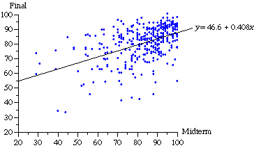
Figure 3 Statistics Test Scores
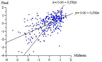
Figure 4 Standardized Statistics Test Scores